

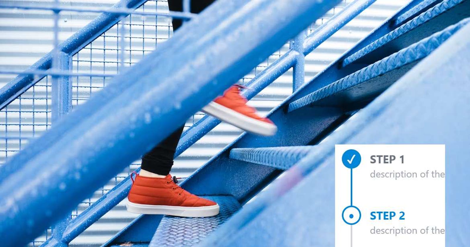
How to create a stepper atomic component using pure css and tailwind
We will see the best way for a developer to consume our stepper atomic component and how to implement it in pure CSS + tailwind


In this frontend pill we are going to create a stepper atomic component in pure css.
We needed it in our design system to complete the onboard wizard at ssonext.com (WIP).
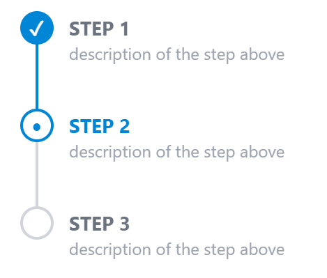
This would be the result:
Before writing the code (that is few lines, really) let's imagine the best way for the developer to consume this component.
What is the best way to consume a stepper atomic component in pure css
Since the componet is in pure CSS, the developer expects to have some classes to create the component.
There are two conditions that we must respect to maximize the developer experience: 1) Minimize the number of tags necessary to create the stepper; 2) Use only CSS: no javscript at all
When making a stepper, the only thing that will be present is the stepper title:
<div>Step 1: do something</div>
<div>Step 2: almost done</div>
<div>Step 3: done!</div>
Then we have to decide how to indicate the state of the step: "to do"? "active"? "done"?
Each state could be a class:
<div class="todo">Step 1: do something</div>
<div class="active">Step 2: almost done</div>
<div class="done">Step 3: done!</div>
The problem with the code above is that active is a very common CSS class, so it is better to be more specific and use classes with detailed names.
So we end up with the following classes:
    <div class='bo-step-done'>
        STEP 1
    </div>
    <div class='bo-step-active'>
        STEP 2
    </div>
    <div class='bo-step-todo'>
        STEP 3
    </div>
Simple and compact. Now it's time to translate the code above to this css atomic component:
How to implement a stepper component in SCSS + TailwindCSS
To implement our stepper atomic component, remember that we want to use pure css: so no javascript at all.
The developer should also be able to implement the stepper using only one html tag (Developer experience: keep the number of tags to a minimum possible).
Drawing the step circle
To draw the circle, we use the following tailwind classes:
@apply h-6 w-6 rounded-full border-2 border-bop bg-bop ;
rounded-full combined with bg-bop will make a circle shape using the main color (the -bop color... see the note below).
Why a border-2? Because we will customize it later for the specific state.
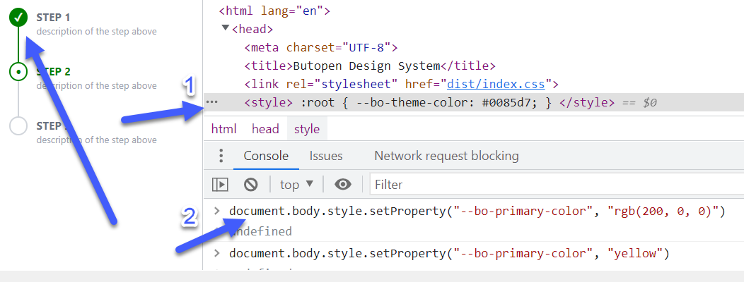
The
-bop color in bg-bop and border-bop refers to the primary butopen color. You can use
-red-600 or -green-500... it's your choice.
The good thing of the ButOpen primary color is that it is a CSS 3 variable so the color can be customized at runtime using a root style (1) or using javascript (2)
The empty circle will extend the filled circle, but using the @apply bg-white class.
We will see how in a moment.
Circle position
The circle will be positioned at the center of the step height, so we'll add these tailwind classes:
flex items-center justify-center absolute top-0
Circle icons
Since we want to have pure css, we had three choices for the icons:
- base64 image data url in css (e.g. using this online tool: https://www.cssportal.com/image-to-data/)
- SVG data url in css (e.g. using this online tool: https://yoksel.github.io/url-encoder/)
- UTF8 icons (e.g. here: https://www.utf8icons.com/)
We are lucky enough to have these icons available in UTF-8:
The check icon in pure CSS: ✓
The bullet icon in pure CSS: •
Drawing the step vertical line
The vertical line will be an empty element with a border.
We can use the following tailwind classes:
@apply block h-full w-0.5 border border-gray-300 absolute top-0 -left-4
The block h-full w-0.5 border border-gray-300 classes will draw the vertical line.
The last three classes are used to position the element relative to the parent.
Let the developer use a single div tag to implement the step
We want the developer to implement the stepper using:
- a single tag
- and a single class
So we use the after and before CSS pseudo classes.
The CSS (SCSS syntax) of the base step is as follows:
._bo-step {
  // the text
  @apply relative ml-8 pb-8 pt-0.5 pl-2 text-sm font-bold text-gray-500;

  // the vertical line
  &:before {
    content: "";
    @apply absolute top-0 -left-4 block h-full w-0.5 border border-gray-300;
  }

  // the icon
  &:after {
    content: "";
    @apply absolute top-0 flex h-6 w-6 items-center justify-center rounded-full border-2 border-bop bg-bop;
    left: -1.7rem;
  }
}
This will be our base CSS structure for the step pure CSS atomic component.
Note that I added a small underscore for the name of the class (_bo-step) since I do not want the developer to use this class directly.
It's like a "private" class.
Having this base structure, we can easily define each step status by customizing some parts:
Look at the result:
The DONE step will have:
- a vertical line using the main color
- a check icon (white color)
- a filled circle (main color)
.bo-step-done {
  @extend ._bo-step;
  &:before {
    @apply border-bop;
  }
  &:after {
    content: "✓";
    @apply text-sm font-black text-white;
  }
}
With @extend we extend the base CSS structure.
Then we override the border color (from gray to primary) by specifying the new tailwind classes in the &:before section.
The same in the &:after section:
content: "✓"for check icon- some tailwind font rules to make the check icon white (remember it is a UTF8 text).
The ACTIVE and TODO steps are similar.
The ACTIVE step will have:
- a vertical line using the main color
- a bullet icon (main color)
- a white circle with a main color border
.bo-step-active {
@extend ._bo-step;
@apply text-bop;
&:after {
  content: "•";
  @apply bg-white pb-1 text-lg font-black text-bop;
}
}
The TODO step will have:
- a gray vertical line
- no icon
- a white background and a gray border for the circle
.bo-step-todo {
  @extend ._bo-step;
  &:after {
    @apply rounded-full border-gray-300 bg-white;
  }
  &:last-child {
    &:before {
      @apply border-transparent;
    }
  }
}
The Complete ButOpen Design System
This component is now part of the ButOpen Design System:
- it's open source
- it's made in pure css (SCSS+TailwindCSS)
- it's easy to consume and integrate into any frontend framework
You can find it here: https://github.com/butopen/butopen-design-system